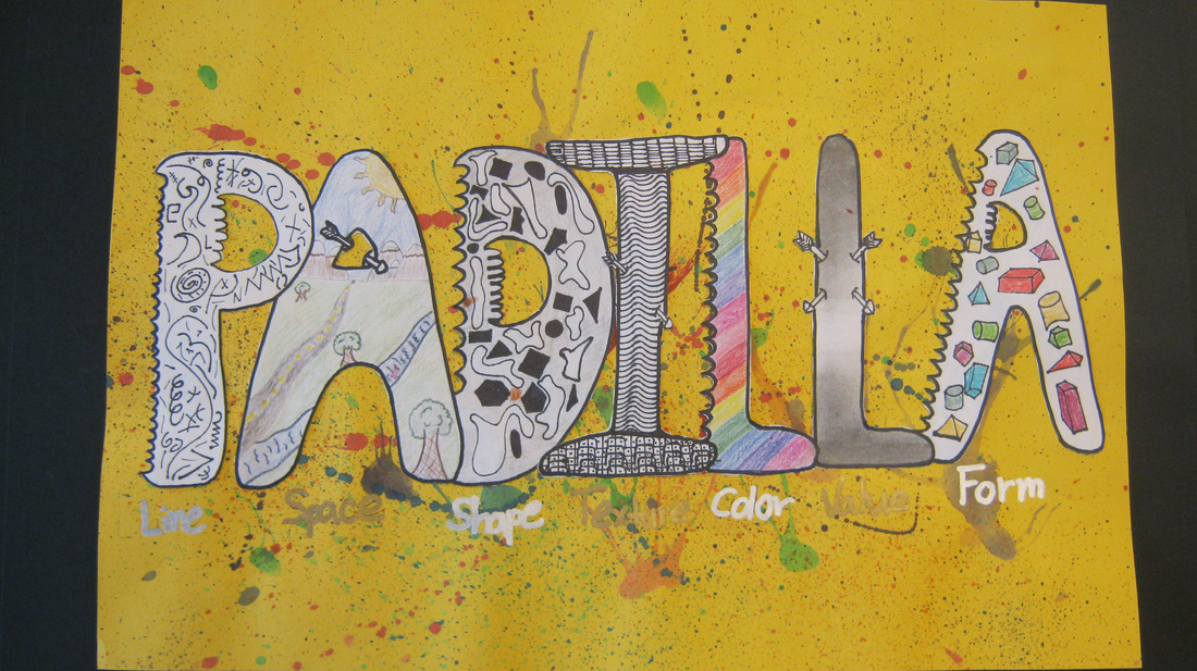
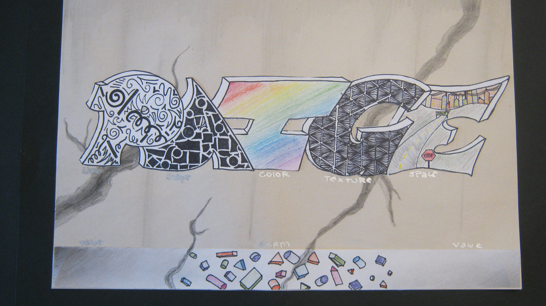
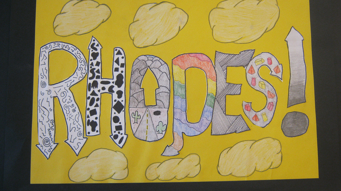
| To begin this project students read an article in Scholastic Art Magazine about the graffiti artist Banksy. Students learned how Banksy used street art to expose people from every walk of life to his work. Then students designed a style of lettering inspired by graffiti. Within the letters of their names students added each of the elements of art. The elements of art are line, color, texture, shape, form, space and value. Can you pick out each element of art in these projects? 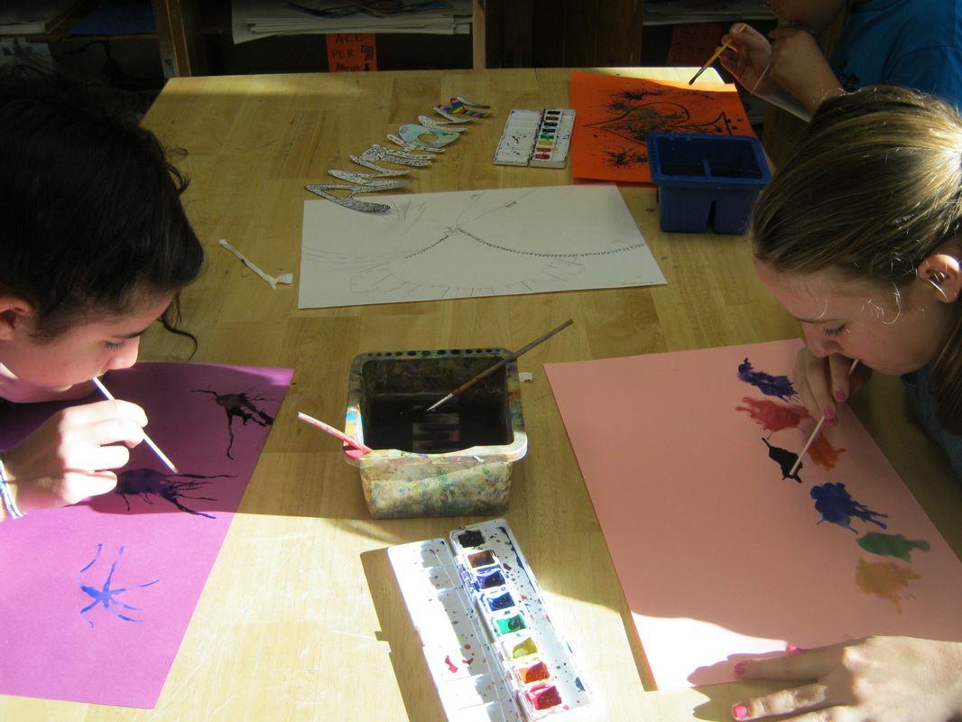 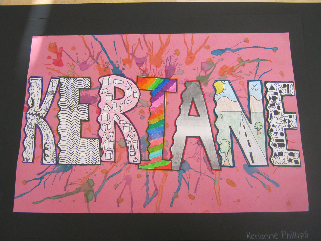 | 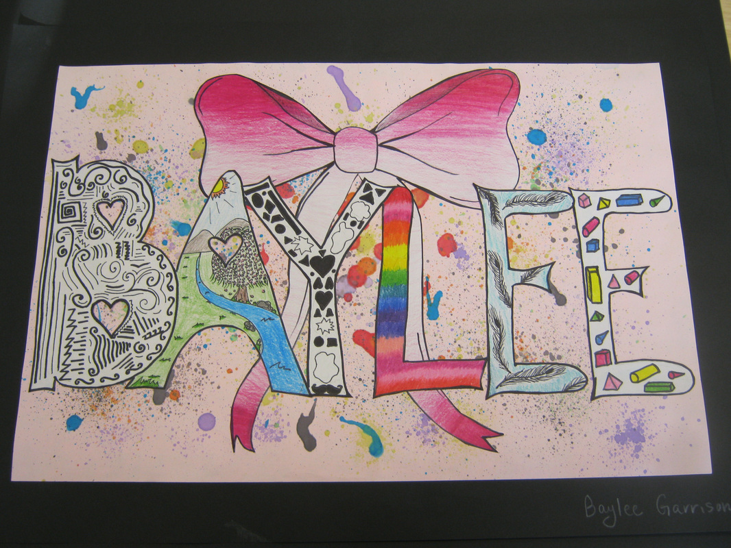 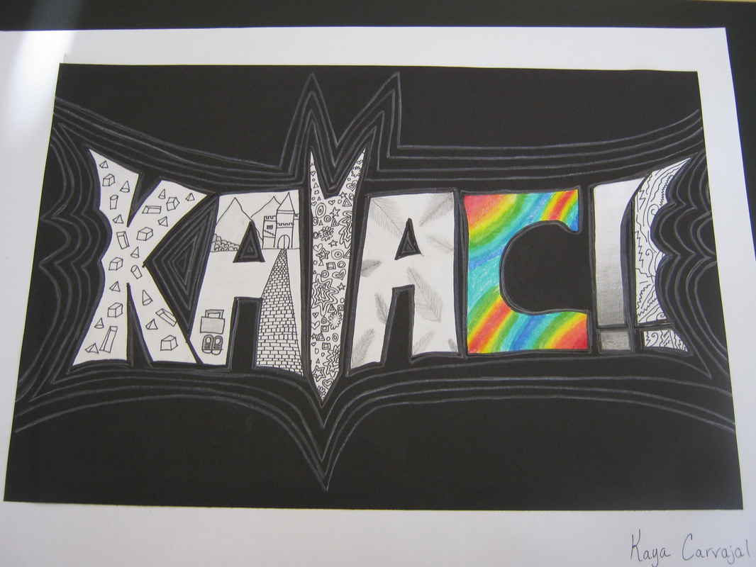 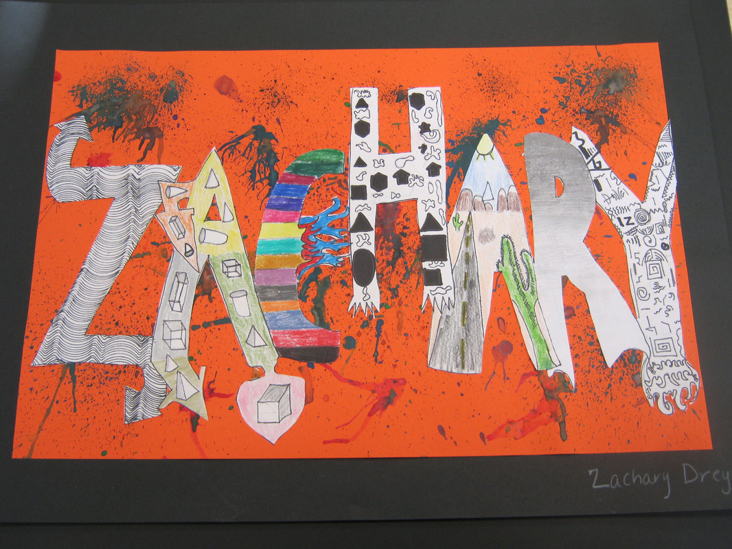 |
1 Comment
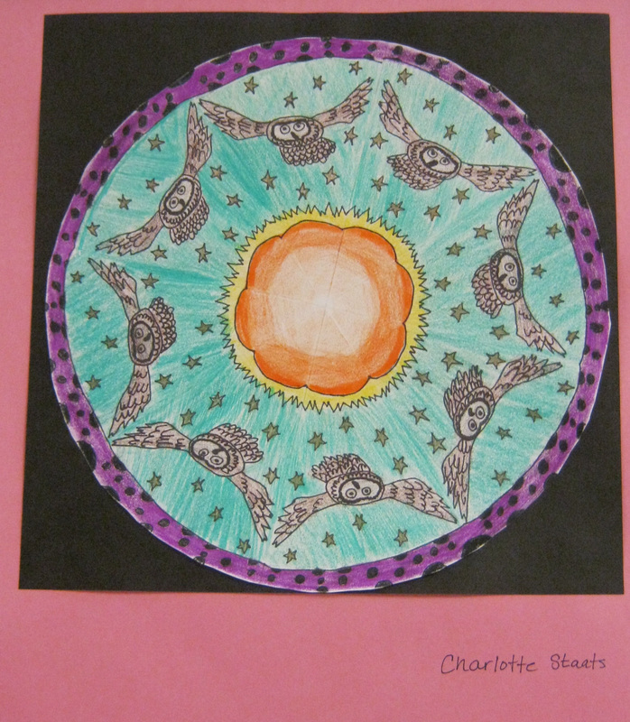
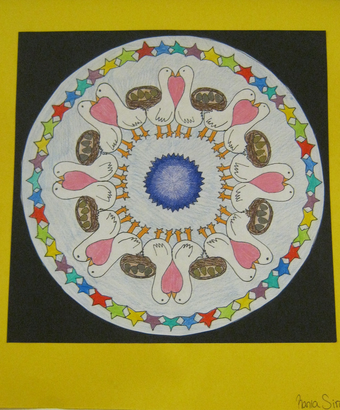
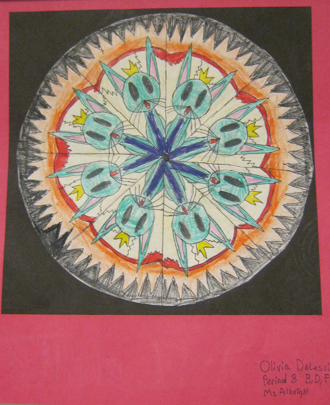
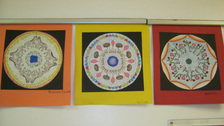
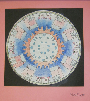
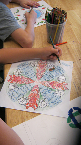
Check out this PowerPoint presentation to learn a little about the history of the Tibetan Mandala.
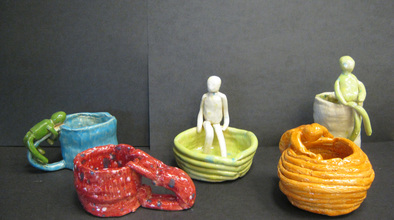 Students did a great job on their coil pots with figures attached. They learned the vocabulary associated with clay and learned the correct techniques for coil construction. 8th grade students also learned about the proportions of the human figure to create the person they attached to their coil pots. 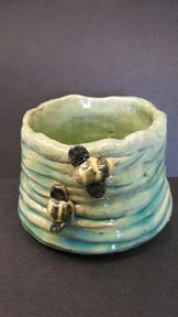 Kaylyn Fino: My inspiration for this clay project was a bee hive. To make this, I rolled may clay coils to layer on top on one another. After doing this, I scored the bottoms and one end of every coil. Before layering on top of one another I had to make a base that was a simple clay circle that was flattened on the bottom. Once I did this I scored the base and put water on it. Then I added the coils slowly layering them in a circular motion. After repeating this step many times, I smoothed the inside. You can do this by adding a little water on your finger or using the smoothing tool. After doing this process over and over again you can choose if you want to leave the outside in coils or smooth it. I choose to leave mine swirly. When I finished that, I choose to add the bee for my animal instead of doing a human figure. I made my bee out of a sphere shaped piece of clay for the body and two circles for the wings. After making the forms I connected theme by scoring and adding water. My project was almost complete after Mrs. Albright put it into the kiln. Finally I glazed my project and it went into the kiln for a second time. I enjoyed doing this project very much, but it did take a lot longer than I would have liked. But I would definitely do this project again! 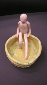 Nina Guido: My coil pot is certainly unique! I tried to make it as neat as possible but working with clay can get messy. My coil pot has a clay person sitting in it. In order to make a coil pot you have to start by creating a base. You have to use a tightly wrapped coil for the base. Then you have to smooth both sides of the base coil to have a secure base and so you don't get any cracks in your clay. Next I began to create coils the size of a sharpie marker. After that, I scored the edge of one of my coils and added water and began to build up the walls of the pot. After that I just repeated the process; scoring the coils, adding water and placing the coil onto the pot. Once I got up to at least three rows, I began to smooth the inside of the pot. Once my coil pot was done I needed to create my clay figure. For the figure I started off making the head. Next I created the torso and kept comparing it to the size of the head to make sure the proportions were correct. Finally I created the arms and legs and scored and added water to attach the limbs. Then I attached the clay figure to my coil pot and I was done!
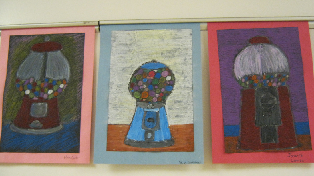
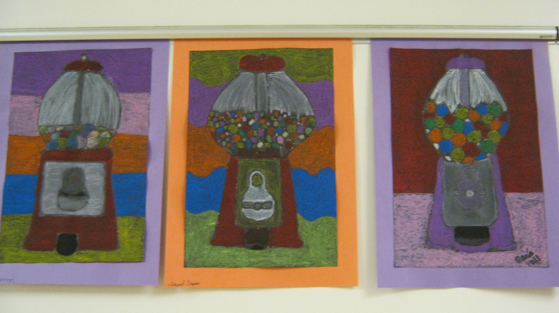
Students created these gumball machines after they learned about the artist Wayne Thiebaud. Wayne Thiebaud is a modern artist who became famous in the 1970's for his paintings of candy and cakes. Students created their gumball machines by drawing from photos and adding color with oil pastels.
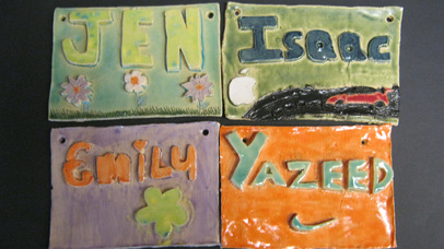 Students learned the correct method for slab construction while creating these beautiful name plates. They also learned about the ceramic process from bisque firing to glazing. Great Job! 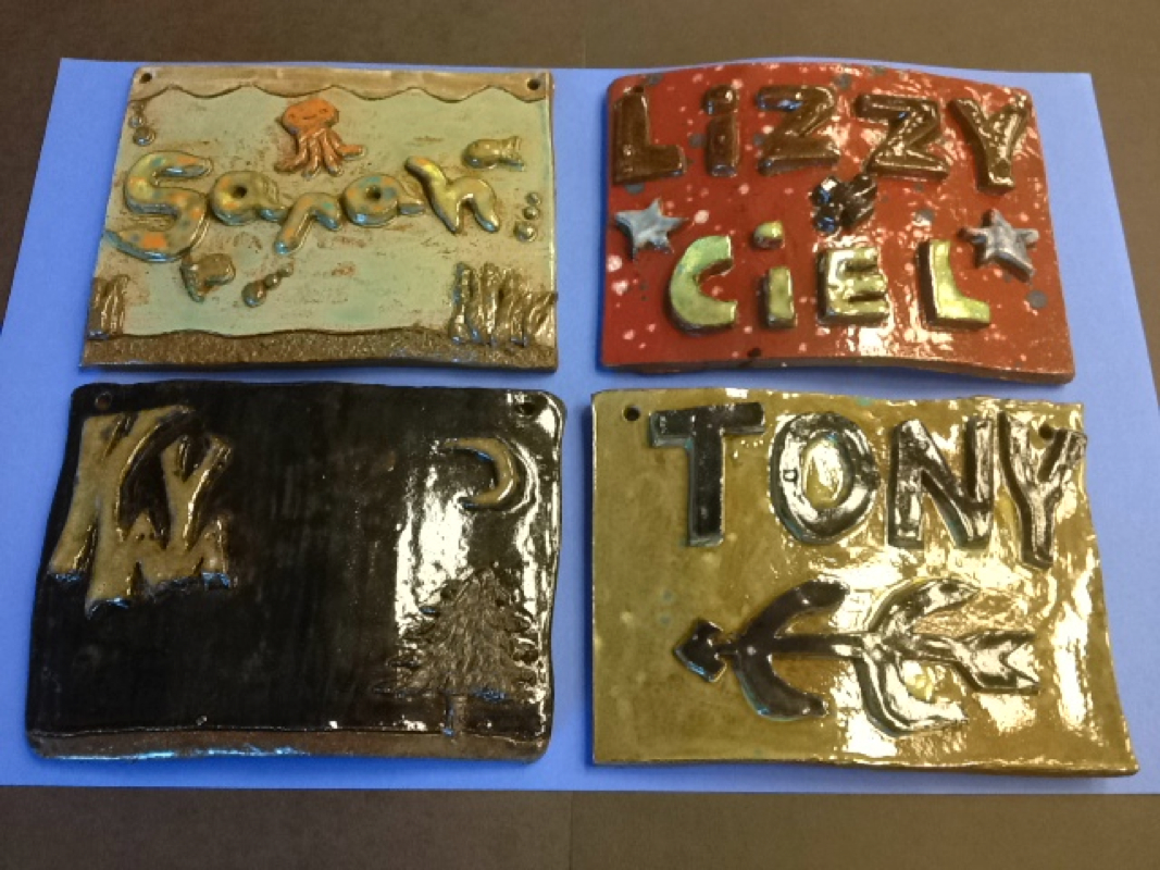
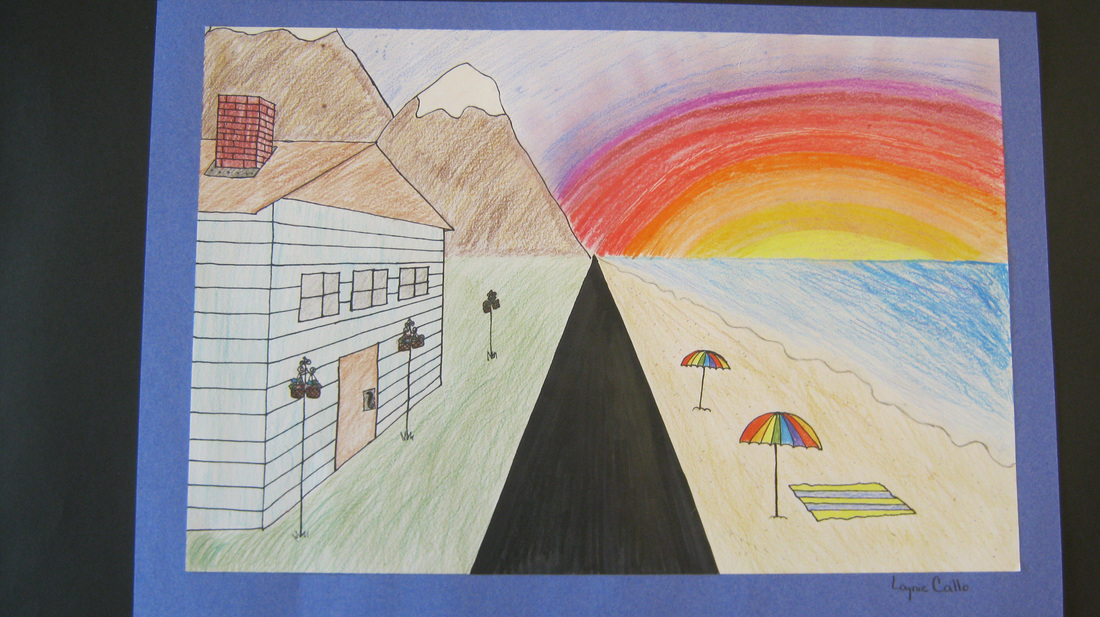
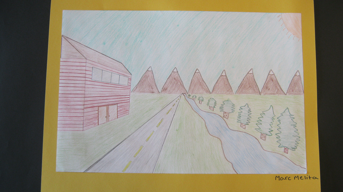
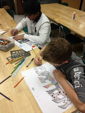 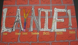 Hello! My name is Laynie Callo. I have recently finished my graffiti name design project. Before I began my project, I learned about the graffiti artist known as JR. JR's work represents and shows the effects of poverty of people’s lives. In one of his works, JR painted large murals of women’s faces that lived in poverty on the sides of many run down houses in the slums of Brazil. For my project, I wrote my name in block like lettering and added form to them. I used the elements of art by putting a different element in each letter of my name. The "L" was the element of line. I used many different types of lines to fill the space. The "A" was the element of shape. For that, I used both organic and geometric shapes that formed to one another. The "Y" was the element of color. I used a solid red background and made many ovals that I colored in the order of the rainbow but I skipped red. The "N" was the element of texture. I created the illusion of the texture of hair. To do this I took a thin sharpie and made quick, short, curled lines over lapping each other. For the "I" I used the element of form. The element of form is the use of geometric shapes that are drawn to have a three dimensional effect. I used as many forms as I could fit. The "E" is the element of space. For this I drew a scene of an open field and a small town with a river going into the background. Because my name doesn’t have enough letters for all the elements to have their own letter, I added an exclamation point. The element I used in the exclamation point was the element of value. For this, I drew very hard onto my paper and decreased the pressure on my pencil as I went along. This gave a fading effect. My background was a brick wall which allows my project to pop. 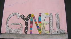 Hello my name is Gynell VanAmburgh. I’m in Mrs. Albright’s 8th grade art class. We have just finished a project where you choose lettering and make it look like graffiti. Then inside of the lettering we put all of the elements of art. For my lettering I chose bubble letters. My favorite letter had the element of line in it. It was my favorite because you can make many different lines. My least favorite element to draw was the element of form because I’m not very good with making things look three dimensional. I put the element of color into the N and put lines to separate the colors. For the element of space I made it look like a road going into the distance. For the element of texture I put curved lines that make it look like it’s over lapping and bumpy. Underneath my letters I put the element of value and made it look like it went from dark to light. 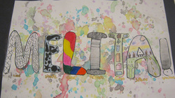 Hello, my name is Marc Melita, I’m in the 8th grade attending the Marlboro Middle School. I really enjoy my art class with Mrs. Albright. The art project I’ve just finished is a graffiti name design. In this project we used our name and made it into graffiti. To begin this project I studied the graffiti artist JR. His artwork really inspired me with my project. JR would go to the poorest towns in the world and enlarge photos of people onto the sides of houses. The design for my letters was fat bubble letters. I chose bubble letters because I liked the way they look. In each of the letters or symbols I would include one of the elements of art. They were line, shape, color, texture, form, space and value. At the end we put splatter paint onto the background paper to make it look like graffiti. I really enjoyed the creation of my graffiti art design.
| AuthorHello, my name is Megan Albright and I am one of the art teachers in the Marlboro Middle School. I teach 6th grade art students, two ceramics class and one section of 8th grade art in the Middle School. I love teaching and I'm excited every day by the amazing work my students produce. ArchivesOctober 2014 CategoriesAll | ||||||||||||||||||||||
 RSS Feed